

SIGHTS SET:
Kate Protage on changing gears
and facing the intimidating head-on.
by Sarra Scherb
If you’re out and about in Seattle, there’s a chance that Kate Protage has seen you—but you may not have seen her. Driving in her stick-shift—camera in one hand, wheel in the other—she could have snapped a shot of a rain-slicked Pike Street as she whisked by, or a quick photo of I-5 under soggy sunset. If her camera caught you, you’d never know: by the time this classically-trained oil painter was finished translating her reference photos to her “Urban Slice” paintings, figures and other details are brushed away in favor of rain-haloed streetlights, sparkling puddles, and snatches of evening sky between skyscrapers.
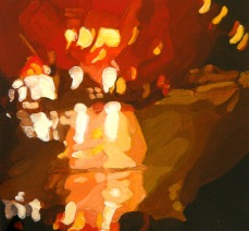
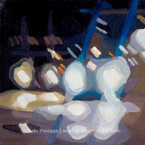
Protage has captured the rushing traffic and rain-blurred lights of streets from around the world in her popular “Urban Slice” paintings over the course of the last decade. She has shown them in a wide range of Seattle venues, and nationally. But the last two years have heralded a shift. She has also begun another body of work that focuses on the one aspect she banished from her snapshots: people.
Up until recently I had perfect vision, but I like to simplify and blur. I want to know what happens when I abstract things.
Mini #97 – 5″ x 5″ – oil on canvas | Mini #62 – 5″ x 5″ – oil on canvas
“A few years ago I was challenged to do figurative work by the guest curator of the Seattle Erotic Art Festival,” Protage recently explained at an artist talk to celebrate a new body of work. “As I’m surrounded by people who do amazing figurative work, it was intimidating.”
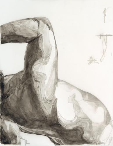
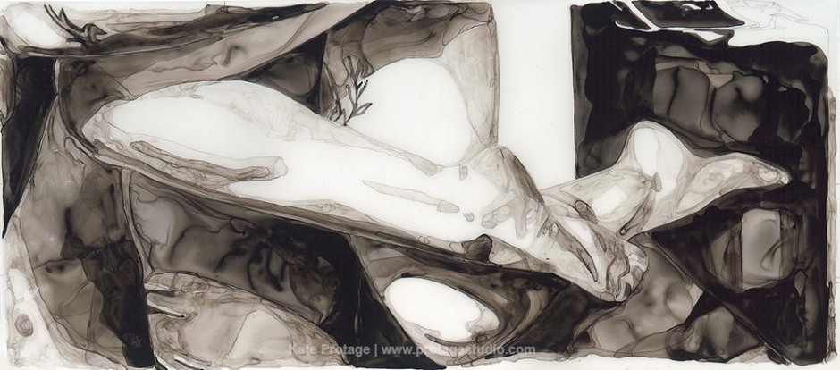
The first series that resulted from that challenge was the “What I See” body of work, which showed tightly cropped sections of the body rendered in monochromatic washes of ink on mylar. Like her “Urban Slice” works, they resided in the liminal space between figurative and abstract; connoting an image, but blurring it, as if seen through wavy glass. Oft-overlooked angles and sections of the body—the crook of an elbow, the back of a knee—were rendered as sensual, impressionistic landscapes.
“We’re bombarded with idealized, unrealistic images of how we should look that are meant to inspire, but can overwhelm and even anger us instead,” Protage wrote of this first series.
“Despite all of the hoopla, the fact is that the everyday things we see…basic parts, like the crook of an arm or the curve of a leg…can be beautiful.”
New Players, Old Stories #5 – Ink, Graphite on Mylar
Since the original series made its debut, Protage has continued to explore its possibilities. “I just kept coming back to that first series. Eventually, I thought, ‘ok, I can do a little more figurative stuff, I guess…’”
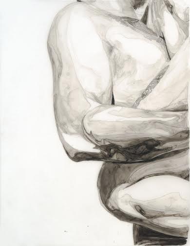
Her most recent series—“New Players, Old Stories”—is the result of a two-person exhibit at Bherd Studios Gallery that paired the artist with classical oil painter Crystal Barbre. Inspired by Renaissance sculptures in Florence and Rome, the two painters mounted a seven hour photo shoot with local models who were asked to approximate the poses of classic sculptures such as Giambologna’s “Rape of the Sabine Women” and “Hercules Killing the Centaur.” While Barbre worked on the large scale with her paintings, Protage zoomed in on compelling interplays between muscles and skin, and intertwined arms and legs.
The title of the series speaks to the “old stories” that these poses reference, which in turn were referenced by Renaissance sculptors retelling Roman and Greek stories. The new players are her models, and Protage and Barbre themselves.
New Players, Old Stories #3 – Ink, Graphite on Mylar
Protage has not only shifted the focus of her imagery, but her media as well. After sketching the image with graphite onto the mylar, she washes extra black india ink on top, diluting the ink with water to create gradations. To control the flow and direction of the ink she pushes and dries it with a hairdryer.
“It’s like playing with crayons,’ she laughed, making pulling and pushing motions with her fingers. She came up with the innovative technique after working with tusche, a greasy black liquid used for lithographic printing. Though she found the brand of tusche she bought inadequate for its intended purpose, its possibilities intrigued her. However, by the time she started this series, she had run out and it was no longer being made. “I tried so many different things to approximate it, and extra black india ink was the closest.”
The result is tactile, elegant and textured, with a luminosity that comes from working on a transparent ground. Crisp edges—in some cases actually crisp-y from the blow dryer’s heat—and fine lines give way to subtle gray washes and white space.
It’s a process that is completely different from the traditional method of starting with midtones: here, she starts with the lightest areas and goes darker, working midtones last.
“Once the ink is down, it’s down, you can’t go back. You have to let the ink be the ink. It’ll go a different way, make a different shape than you wanted or expected, but you have to let it go.” It’s been a challenge for Protage, who is happy to own up to her need to keep creative control. “I truly learned the meaning of ‘happy accident!’”
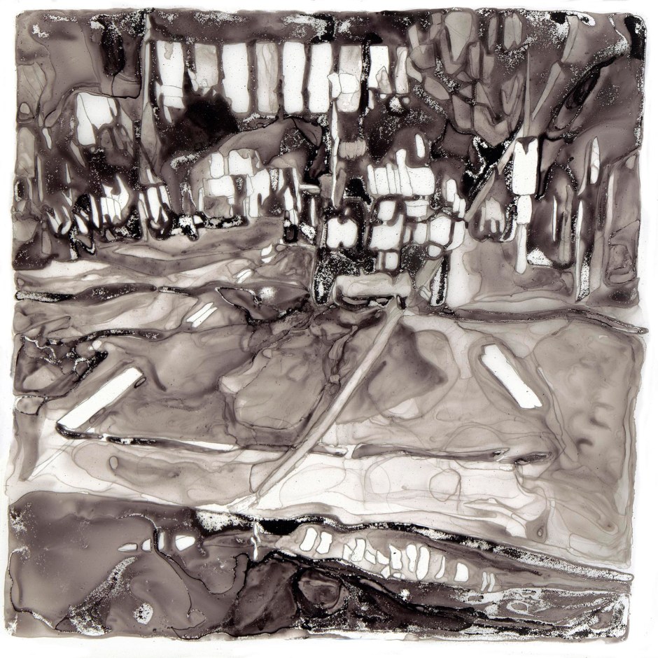
Urban Geometry – Ink, Graphite on Mylar
Protage’s work inhabits the gray area between abstract and figurative.
From city-scapes to the landscape of the body, she continues to bring our attention to vistas that we might otherwise ignore. The next time you see her sweep by in her car, camera at the ready, give her a wave; you might see yourself reflected in her blurred, impressionistic world.
–
Kate Protage is represented by SAM Gallery.
Contact her at protagestudio.com
Article written exclusively for and published by WEAVE Magazine, Volume 1, March 2014.
